
Sustainable Style - Recycling old clothes
Role: Lead UX/UI Designer
The Product
An app to help people recycle their old clothes by quickly selling them by weight using an easy built-in calculator.
Project Duration
July 2023 - December 2023
The Goal
To create an app that gives people the ability to sell clothes in bulk by weight. This will be accomplished through an in-app clothes weight calculator combined with drop-off delivery points. The app will quickly calculate the value of the clothes being sent so the user knows how much they will receive.
The Problem
The world is creating a huge amount of disposable fashion which is having a detrimental effect on the environment. The problem is when people are finished with clothing it can be time-consuming to sell piece by piece. To sell in bulk can also be difficult as you have to take the clothes to a specialist to be weighed which might not be local.

Understanding the problem
To begin the project, I conducted an online survey across a broad spectrum of people to identify common challenges faced when buying or selling used clothes. Prior to the survey, we had made assumptions that the product would be competing with other online methods so focused the survey around current digital methods. We discovered this is a popular choice as every participant had used at least one method.
As part of this project, we did a competitive audit of a broad spectrum of businesses currently offering methods to sell old clothes. The insights gathered from both would allow us to target the users' pain points and find the gaps in the market. Our survey found the following are the main pain points for our target demographic:
-
Time wasters and scammers when selling
-
Lack of interest when selling
-
High costs when selling
-
Lack of time to sell
Meet the Personas
From the study, we determined two personas that would need to be catered for by the app. The first persona was an expecting father who needed to clear space quickly of unwanted goods. The second persona was an eco-friendly mother who wanted to sell/pass on unwanted goods to support others and protect the planet.


Wireframes
We created wireframes to allow us to test the primary user flow to see if the experience performed as expected. This would allow for quicker iterations prior to applying branding, colours and fonts. The testing performed on the wireframes discovered some key pain points that we were able to address for a seamless experience.


Iteration
After creating our prototype from low-fidelity wireframes, our team prepared an unmoderated usability study for participants. We asked 5 participants to run through different a selection of scenarios in our prototype in hopes of garnering enough feedback to use for each set of design iterations. We found the following:
.png)
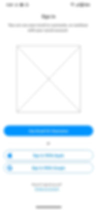
Login Screen
The login screen was an issue for some users who felt there was a lack of "Social Media" methods for creating an account. It was also noted that they would like the quick logins should be first. However, we chose to go with the email method first as the quick login methods would be closer to the reach of the thumb of a mobile device. We also prioritised all login methods on the screen to make all options easier to access.
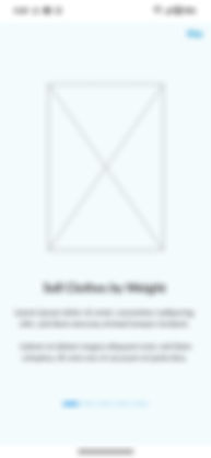

Onboarding Screens
The original wireframe included a very simple multi-bar system, that highlighted the bar representing the slide of the onboarding process you were on. This however gave no clues on how to interact with the page and left people confused as to how to proceed. Instead a multi-dot approach was taken coupled with a clear text prompt to indicate the action required, combined with an arrow icon to clearly show visually what was required.

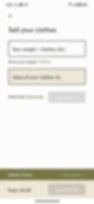
Calculator Screens
The original wireframe included the setup of the calculator and instructions. These areas only needed to be used once to set up the calculator for use. To prevent them from being confused with the calculator itself they were moved to a screen prior to the calculator. This simplified the layout making it easier to add multiple bags to the order. The basket area was also missed as it didn't clearly state what it was. This was updated with clear messaging about the basket and the content of the basket.

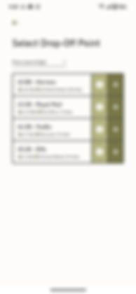
Drop-Off Screens
The original wireframe included details about the drop-off points that could be used to send the clothes once they had been weighed and added to the order. However, some participants struggled to understand how to find out more details, and how to add their selection. In the final design, we addressed this issue by clearly adding the information to the left and highlighting buttons on the right. We then also added the ability to change the sort order, allowing people to choose from price, distance, or star rating.
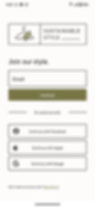
Style Guide & Components
Combining an earthy colour palette with a clean friendly font helped to create Sustainable Style's eco-friendly look. The rest of the design adopted this clean aesthetic to stay on brand and increase usability.

Live Prototype
Below is the live prototype which was created using Adobe XD. The end result included clean eco-friendly style branding that would appeal to the target audience. By focusing the design around usability the final design was clear and concise. Please enjoy the live prototype below:
Takeaways
This project was completed as part of my Google UX Design Professional Certificate and was created using Adobe XD. The usability studies completed during the project helped improve the design and allowed me to avoid my own bias. This resulted in a better user experience for the main user flow. Targeting the main user flow allowed me to identify areas where people could get stuck or lost through assumed knowledge that was built into my designs.
"Creating an order using the calculator was key to the success of the project, so was the focus of the user testing."
Key takeaways
Before starting the wireframes I felt more detailed information could have been gathered about people's behaviour in regards to old clothes. This could have helped the app better target people's pain points, rather than just competing with competitors. The use of quantitative and qualitative data points helped highlight areas where we lost people or didn't provide enough information to enable the user to progress. If I was to continue this process of making improvements I would try testing variants with a wider selection of users to see how small changes could improve the user journey. I would also focus more time on the supporting areas of the main user flow. Things like the FAQ area, past orders and order tracking would also need more time to research and develop as these are also key to the user experience.